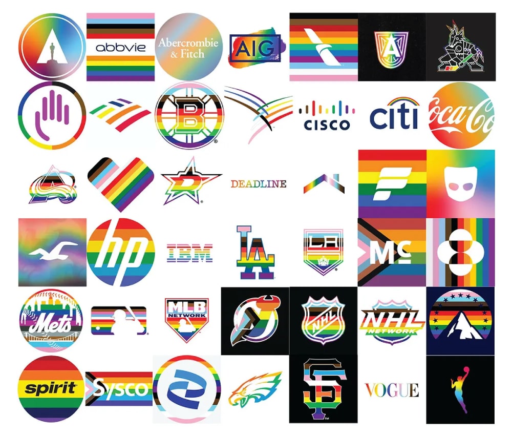
Rainbow branding has become a powerful tool for brands aiming to express diversity, inclusivity, and creativity. From tech giants to social movements, the use of multi-colored logos is more than just a visual choice; it's a statement of values and purpose. By integrating a spectrum of colors, brands create a sense of energy, openness, and modernity that resonates with a broad audience, driving engagement and fostering a strong emotional connection.
The Meaning Behind Rainbow Branding
Rainbow logos often represent much more than a vibrant color palette. Here are a few reasons why brands choose rainbow-inspired designs:
- Symbol of Diversity and Inclusivity: Rainbow logos are widely associated with diversity and inclusivity, often used to support LGBTQ+ communities or to signify equality and acceptance. Brands like Mastercard and Skittles have temporarily adopted rainbow versions of their logos during Pride Month, aligning themselves with the values of inclusivity and social awareness.
- Expression of Creativity and Innovation: A multi-colored logo can also signal creativity, playfulness, and forward-thinking. Companies like Google and Microsoft use rainbow colors in their branding to convey innovation, creativity, and a dynamic approach to technology and problem-solving.
- Attention-Grabbing and Memorable: The use of multiple vibrant colors in a logo can make it more eye-catching and memorable. For brands looking to stand out in a crowded market, a rainbow palette can help them achieve instant recognition and recall.

Iconic Examples of Rainbow Branding
Several brands have embraced rainbow logos, each using the design to communicate a unique message:
- Apple's Classic Rainbow Logo: In the 1970s, Apple adopted a rainbow-striped logo, which became synonymous with the company’s early identity. The rainbow colors symbolized creativity, diversity, and the innovative spirit of the brand, aligning with Apple's mission to “think different.”
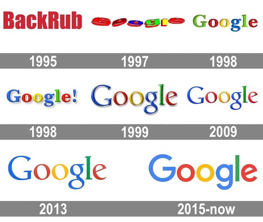
- Google's Colorful Identity: Google’s logo is a prime example of effective rainbow branding. Its multi-colored design, with primary colors punctuated by a single green letter, conveys simplicity, playfulness, and diversity. The color scheme suggests a balance between creativity and logic, reflecting Google's dynamic yet user-friendly approach.

- NBC's Peacock Emblem: The NBC logo, featuring a multi-colored peacock with six distinct feathers, symbolizes the network's diverse programming and wide-ranging content. The rainbow palette conveys vibrancy and variety, reinforcing NBC's position as a leading broadcaster.
Why Brands Are Embracing Rainbow Logos
As consumer values evolve, brands increasingly recognize the importance of aligning with social causes and promoting inclusivity. Rainbow branding provides a way for companies to communicate their support for these values visually. Moreover, in a fast-paced, image-driven world, multi-colored logos offer a fresh, dynamic approach to branding that captures attention and fosters connections across diverse audiences.
Brands like Apple, Google, and NBC demonstrate how rainbow logos can convey more than just a splash of color — they can express a brand's values, mission, and commitment to diversity and innovation.